Company
Alcohol Help, at Recovery Worldwide
Alcohol Help, at Recovery Worldwide
Category
Infographic Illustration and Information Design
Infographic Illustration and Information Design
About
Alcohol Help is one of the digital web properties run by Recovery Worldwide, a company that assists in connecting visitors to a rehab facility. Their websites not only help people find rehab but also contain several educational articles on addiction.
Alcohol Help is one of the digital web properties run by Recovery Worldwide, a company that assists in connecting visitors to a rehab facility. Their websites not only help people find rehab but also contain several educational articles on addiction.
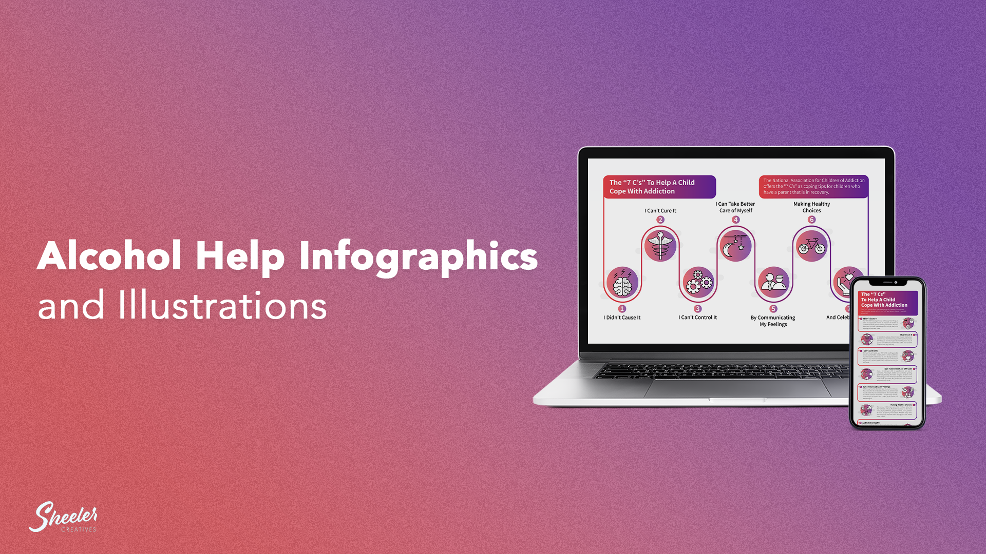
One of these web pages contained an article with an overwhelming amount of information on it. I was assigned to create several branded infographics to help break up the different parts of the page into more manageable pieces and create visual interest.
These infographics include The 7 C’s to Help a Child Cope with Addiction (long and short form), multiple Tips for Communicating with a Loved One, as well as Signs of an Enabler.
For these infographics, I designed several branded icons, as well as gradients that used the brand’s colors.
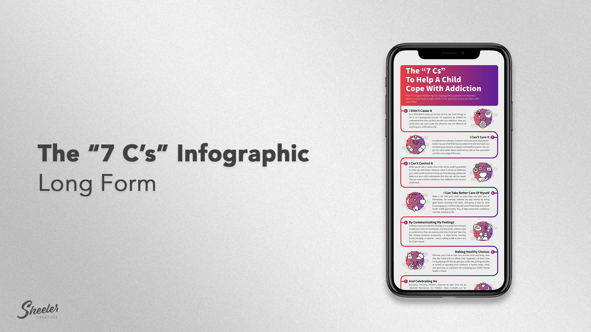
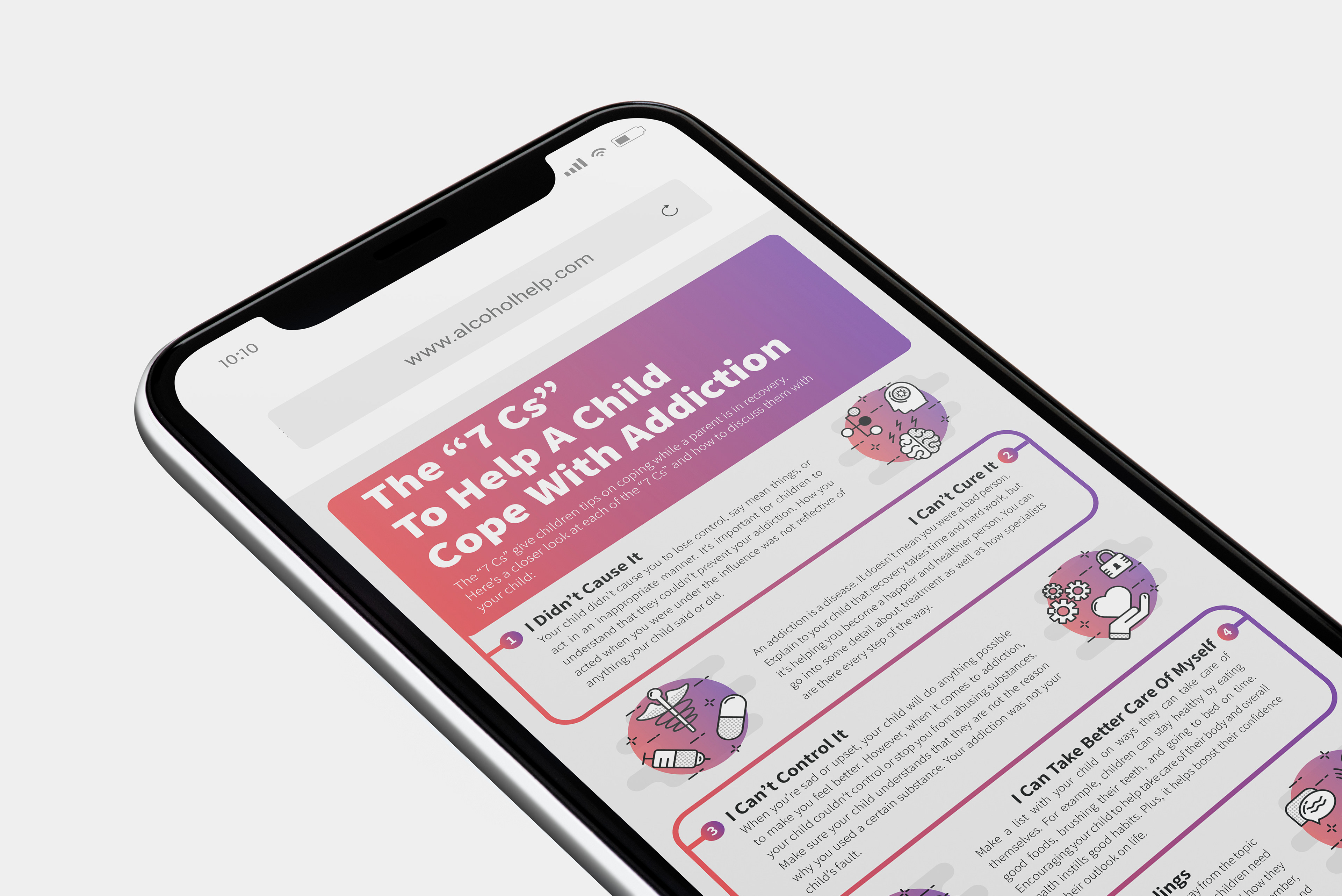
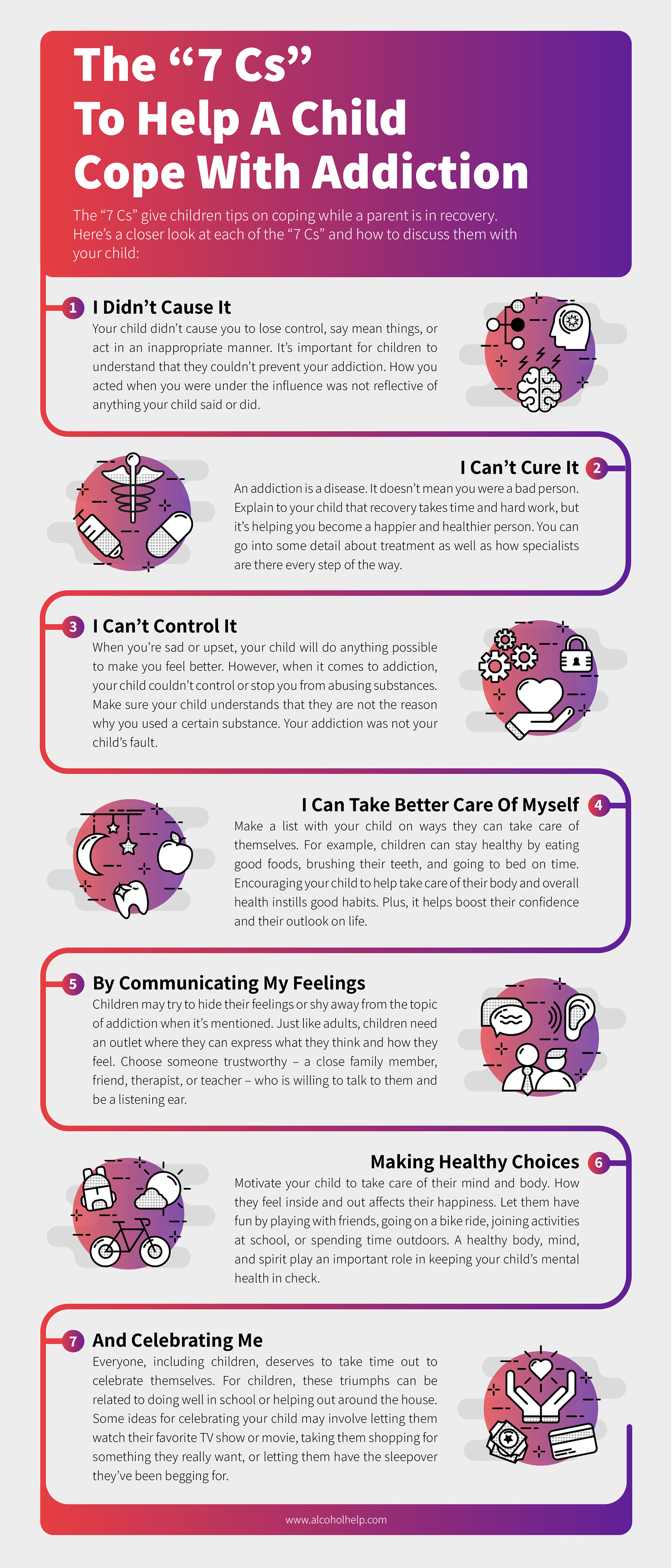
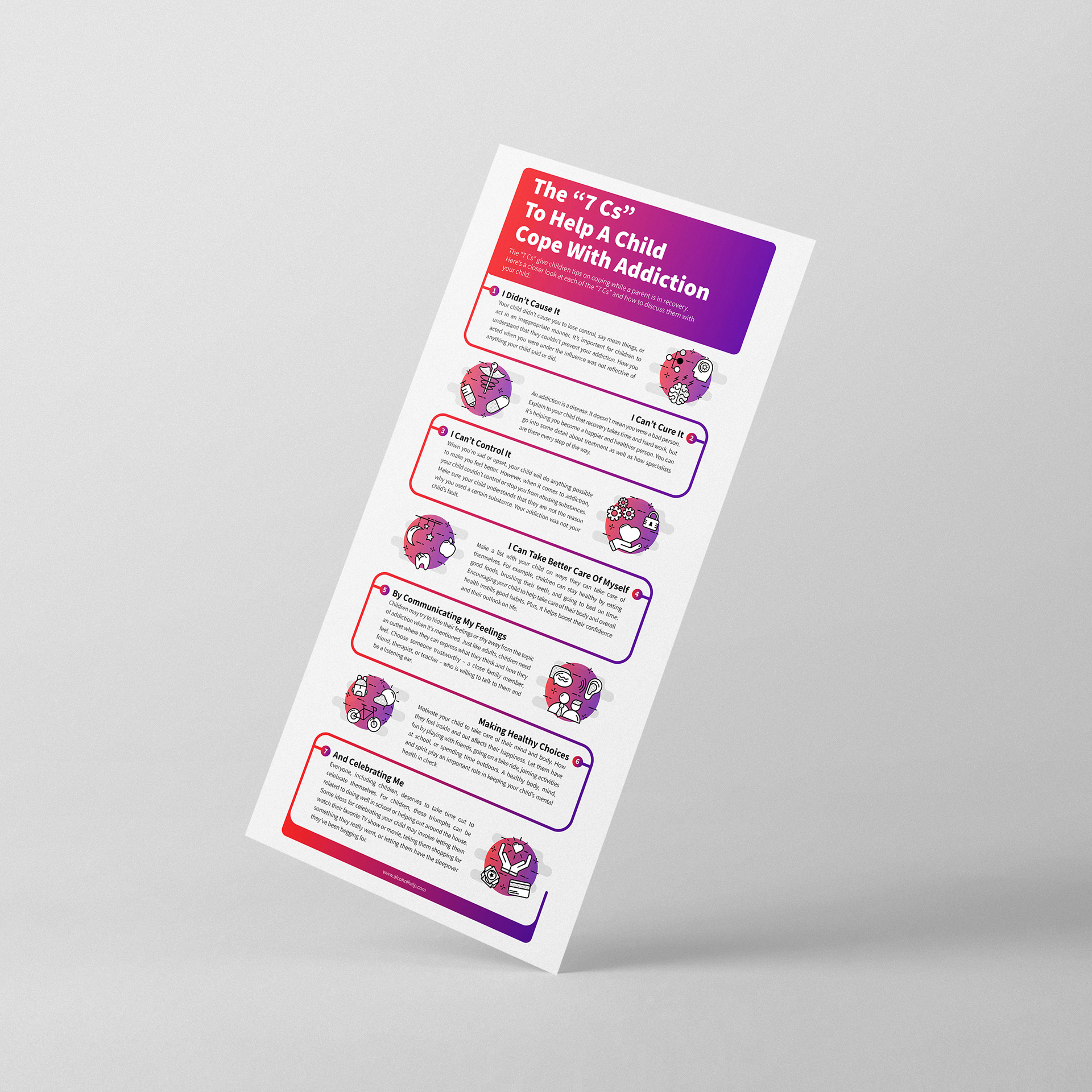
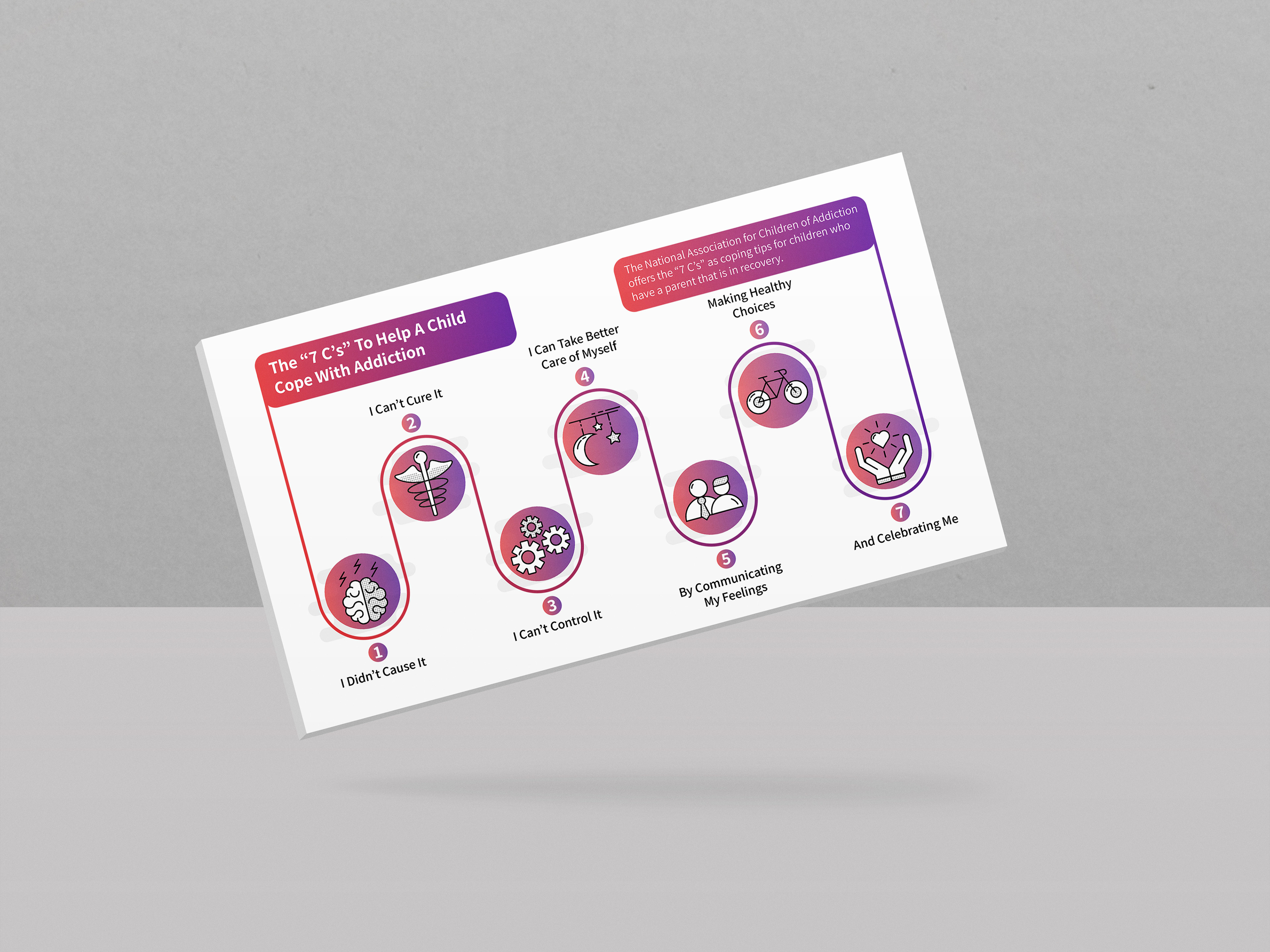
The "7 C's" To Help a Child Cope with an Addiction is an article that covers sensitive material. Since it had to deal with children, I wanted to create a welcoming yet professional aesthetic that a parent can show a child while also sticking to the web-site's brand.
The main color palette for Alcohol Help is a vibrant gradient of red and purple. Since it is such an eye grabbing combination, I did not want to over use it. To ensure good visual hierarchy, the most prominent use of the gradient is on the title of the infographic. This creates an entry point for the composition.
After reading the title, a line forms beneath the brief introduction and acts as a guide for the viewer to follow for the rest of the infographic. This line features the same bright gradient as the title, allowing for a more dominant visual weight throughout the paragraphs and illustrations.
To ensure the infographics illustrations are not over powering to the viewer, each one features a less saturated version of the gradient. This allows for the infographic to be cohesive while also creating strong visual hierarchy.
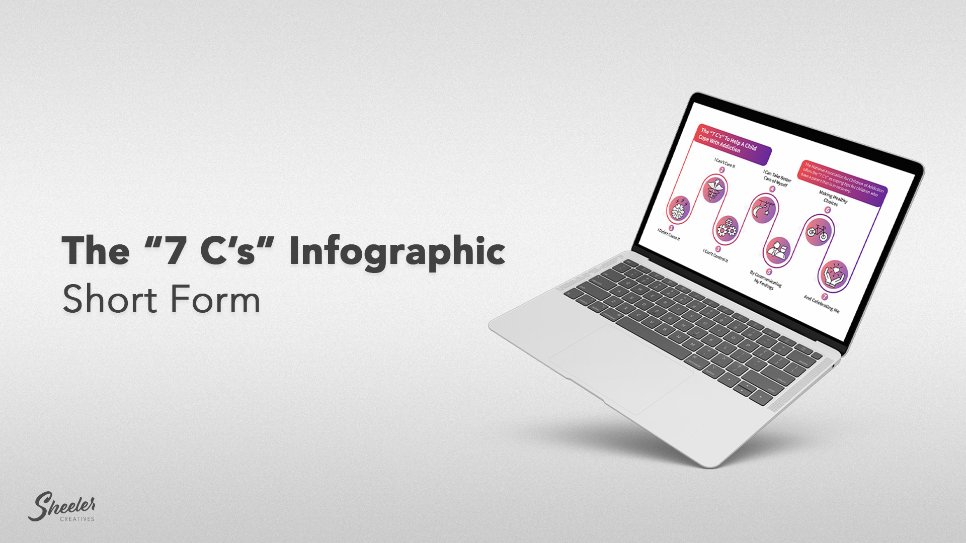
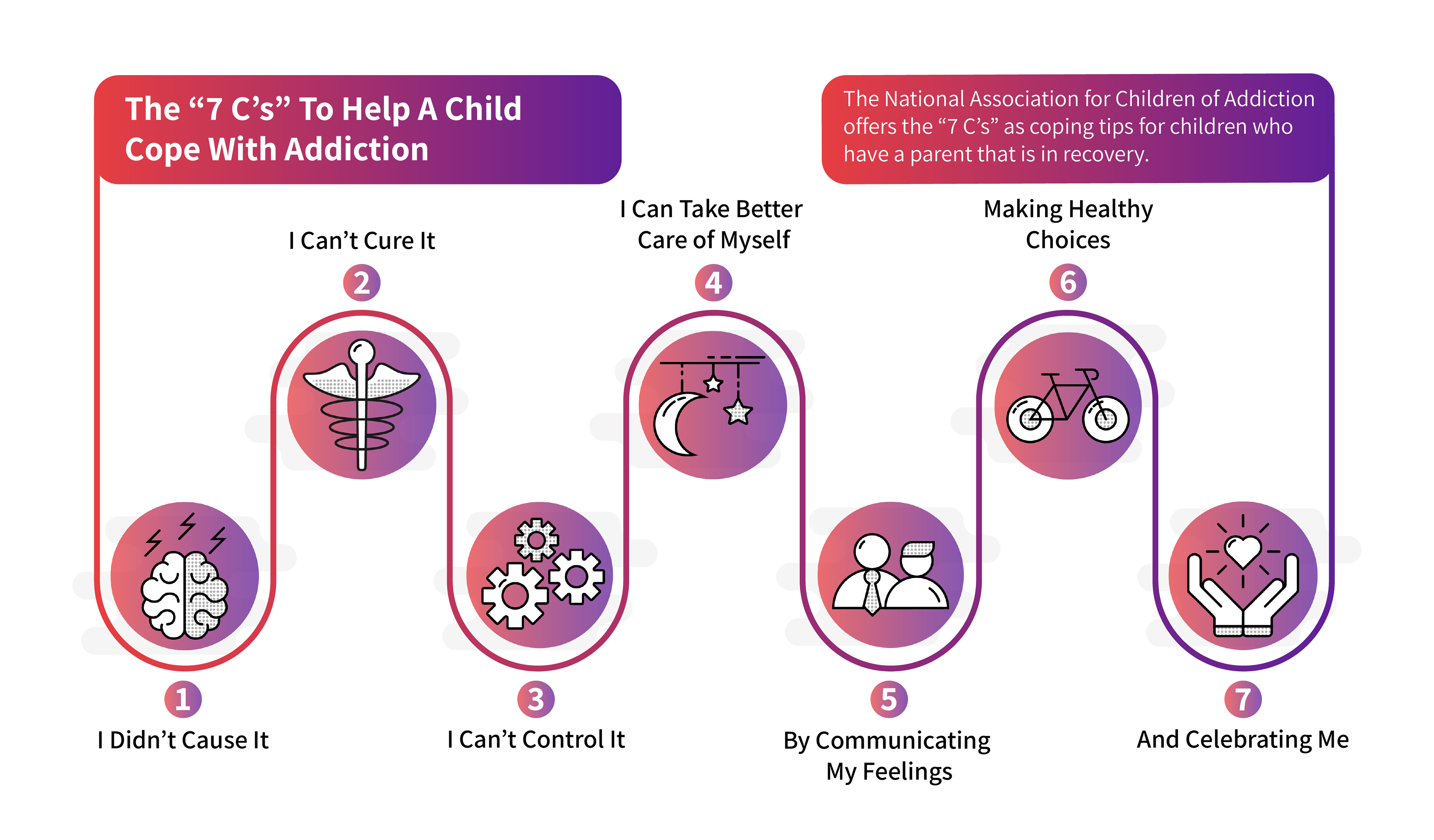
The short form of the infographic was created to allow for a more simple breakdown of the information. This composition features a landscape orientation rather than portrait, which can more easily fit on a desktop screen while the long form is better suited for mobile.
This shortened form can also communicate the highlights of the article more quickly. While it still features the same illustrations and bright gradient, some of the body copy and decorative elements have been taken away to allow for more clear processing.
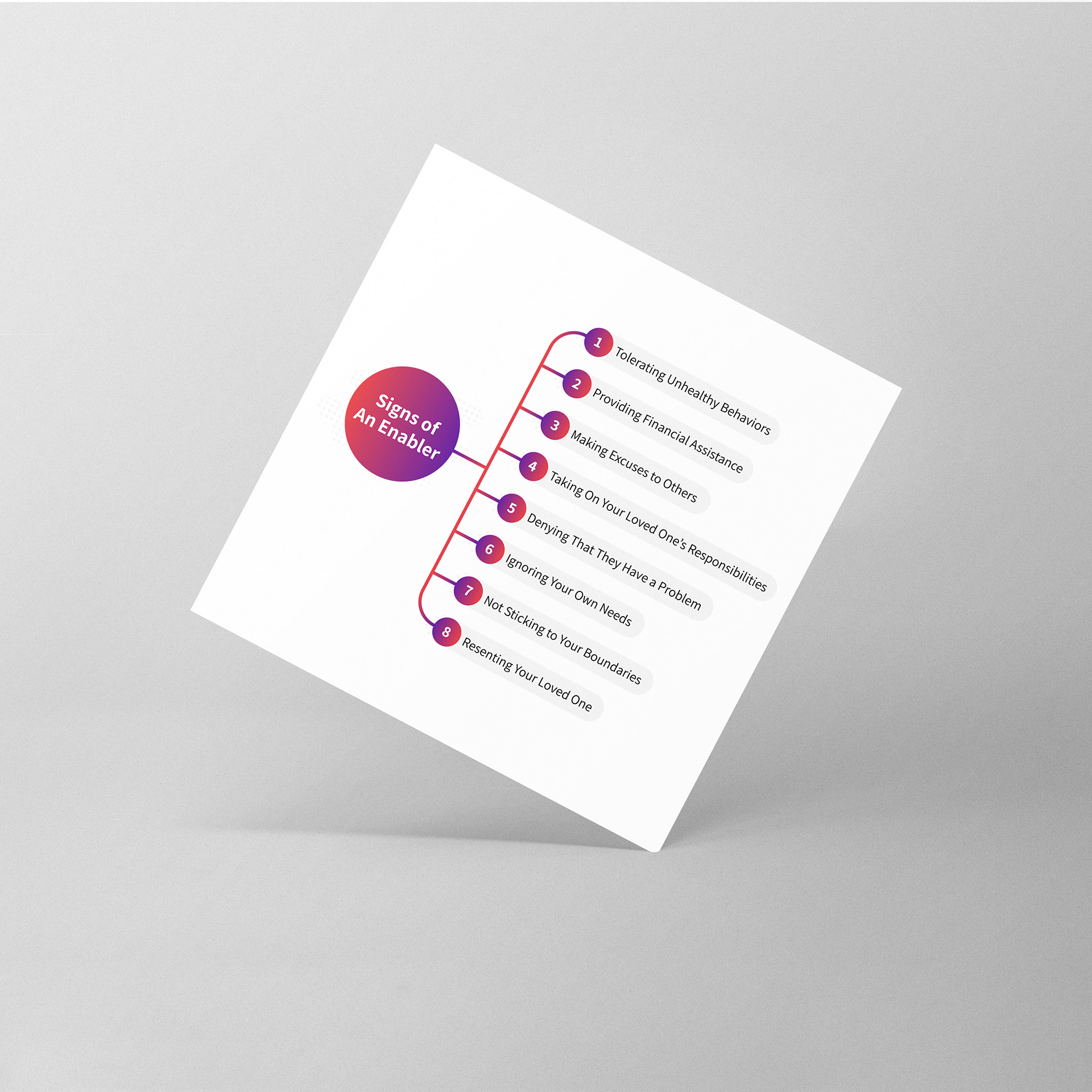
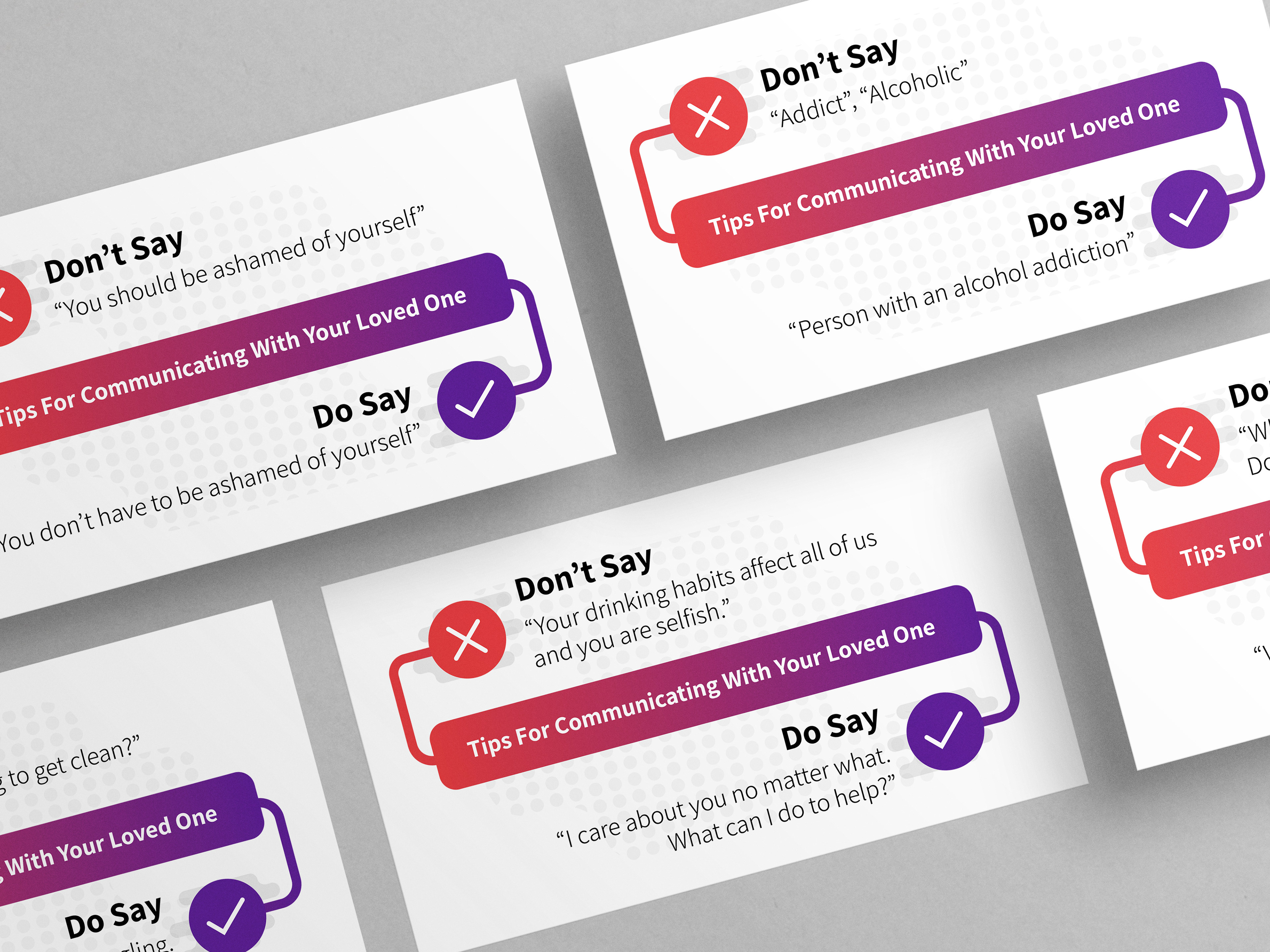
Some other infographics were made for smaller points of the article. This included multiple Tips for Communicating with Your Loved One, and Signs of Enabler. Both of these infographics stay within the same style as both of the 7 C's to Help a Child Cope with Addiction.
Tips for Communicating with Your Loved One uses color theory to help the viewer understand the information quickly. The gradient features a red to purple transition, with red being on the right. Since Red can be associated with "stop" and "danger", this color was used to communicate the "Don't Say" information. The purple end of the gradient was used to communicate the "Do Say", as purple is less harsh than red.
The Signs of an Enabler keeps within the overall style while communicating a simple list of signs for the viewer. The larger circle on the left side of the composition features the title and is the jumping in point for the infographic. A line then guides the viewer to the right for list of information for the viewer.